skip to main |
skip to sidebar

Ideas must be put to the test. That's why we make things, otherwise they would be no more than ideas. There is often a huge difference between an idea and its realisation. I've had what I thought were great ideas that just didn't work.
- Andy Goldsworthy, British artist
It's entirely possible the architects of this ultra modern residence in Inner Mongolia, China designed the space with snow in mind.
If so, a stroke of brilliance, no? (Not that the design lacks in any way without it.) If not, then how about a wide border of white quartz gravel?
 (Design by New York-based architects Multiplicities. Learn more about the house here.)
In a recent interview, popular novelist Carl Hiaasen described our culture's current fascination in watching celebrities "run off the rails." The descriptive word he used was delamination, like layers coming apart. In interior design, Clarke & Reilly use this concept to great effect in the way they allow layers to show through (see previous post).
In the case of three-legged furniture, could it be there's something pleasantly delaminating about seeing three when you'd expect to find four? Maybe it's a combination of tension and instability with the whiff of danger it implies that's so intriguing. See this point used well in the sculpture "Broken Chair" by Swiss artist Daniel Berset, seen here standing outside the United Nations office at Geneva. Wiki explains that the chair's design was intended to "symbolize [an] opposition to land mines and cluster bombs and act as a reminder to politicians and others visiting Geneva."

Below, bringing that same delamination to two three-legged versions of the classic Eames chair: c. 1944.

The idea slightly more refined in the Hans Wenger Shell chair.

Whatever the three-legged design gives up in stability it gains in giving the sitter more leg placement options, at least in the single front leg version. (Careless toes wandering under the weight of that single leg beware; there's likely enough psi there to crush a bone.) The three-legged version has a much more avante and outré quality than do its four-legged cousins.
Taking the three-legged chair to its most practical extension, Danish designer Hans Olsen created the Roundette set in 1962. Here, the three leg posture allows the chairs to be tucked flush under the table and out of the way.

The legacy of three legs is a long one; The Elizabethan era turned chair, below left, is c. 1580 though it's said similar designs date back to the middle ages. The chair on right is a 19th century reproduction of the Glastonbury chair. Both serve as jumped up variations of the three-legged stool was more often the favored contemporary seating for both bewigged prince and benighted peasant.

As for stools: These are from another Danish designer, Morgan Lessor, from 1942.

Frank Lloyd weighed in with his own version with this reproduction from his 1937 design (see it here).

These two takes are from from Italian designer Carlo Molino, c. 1950.

While this Molino chair may not have three-legs, its anatomical inspirations make up for it.

The shadow cast from this chair is not the least of its charms.

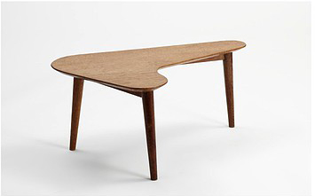
From the era of kidney-shaped pools, Miró covered jazz albums, and vacuum cleaners shaped like rockets comes the Boomerang table from British designer A.M. Lewis, c. 1950.

And finally, this: A stunning "Victorian Tri-leg Tavern Table", c. 1900. Traditionally, tavern tables had four legs and a single drawer. Stretchers were also a common component (wood cross-pieces securing the table's legs together near the bottom). This table, of course, has none of that. The single leg does however force the table to be displayed in exactly the way the designer intended which only adds to the brilliance of it.


An example of traditional delamination at its finest. See the table at Blackman Cruz here.
White, like black, always works: Ever flexible, always relevant for whatever the circumstances or culture. As the universal symbol of opulence and purity, it's both the Taj Mahal and the bride.  The quintessential Ferrari will always be red. But the Rolls Royce, it owns the white.
 A white room is the picture of serenity, a place for serious and elegant contemplation, for deep breaths and clearing minds. One not befitting ex-husbands or children.
 An invitation to the sun: A nook for nourishing the soul as well as the body.
  White represents not only the absence of hue but of noise. It's a visual silence. Its effect is both quiet and quieting.
 White would come to represent humanity's highest aspirations. With the increase of the scale of the state so too the desire for architectural white. The great pyramids of Egypt were once encased in white limestone as were the temples of Greece in white stucco. And more recently, there's The White City of Tel Aviv. A more contemporary palace above, one probably not designed for communion with the gods though Aphrodite and Dionysus would surely be at home there. As would no doubt Telete (a spirit who presided over orgies; I Googled it) and a yard teeming with nymphs and satyrs.
  A chair and table wrapped in an elastic white PVC covering by designer Jurgen Bey, part of the Krokon Furniture collection. See more here.
 Chairs and chandeliers reimagined in white.
 And the art: White sculpture by way of Louise Nevelson (White Vertical Water, 1972): The noise of the underlying structure is buffered under many coats of white paint;
 White painting by Jasper Johns (White Flag, 1955): An icon whitewashed over and all that it implies;
 Sol Lewitt (Four-sided Pyramid, 1997);
 Agnes Martin (Morning, 1965: graphite pencil grid on white acrylic): Martin described the painting this way:
 “I was painting about happiness and bliss and they are very simple states of mind, I guess. Morning is a wonderful dawn, soft and fresh.”
The hard part was knowing what to leave out, she would say. Below, Kazmir Malevich (Suprematist Composition: White on White, 1918) and the painting that was to be one of the many “the end of painting” paintings.
Robert Rauschenberg with White Painting, 1951: White house paint covering a series of stretched canvases, Rauschenberg too was accused of bringing a premature death to painting. His friend composer John Cage saw something else. He called the paintings “airports for shadows and for dust, but you could also say that they were mirrors of the air.” Cage, a committed practitioner of Zen Buddhism, found much appeal in the painting's “blankness” as a foundation for contemplation. Inspired by Rauschenberg, Cage went on to famously compose his own white canvas in "music" with 4:33, music as an interval of silence (the piece was as long as the title indicates). The composer spoke of wanting to create something with “the color and shape or fragrance of a flower,” a blank canvas for contemplation and experiencing the moment. (No doubt, most audiences heard only silence.)
His whiteness: The young Rauschenberg before his canvas. Interesting to note how the gallery chose to blacken the walls behind the piece, perhaps to louden up the silence some.
It all begins with Alan Watts. He is the man often credited with helping to bring Eastern philosophy into the Western consciousness. His critics accused him of trying to demystify mystical experience. How so? By writing about it. In particular, for writing things like this: The task and delight of [art] is to say what cannot be said, to eff the ineffable, and to unscrew the inscrutable.
 "To eff the ineffable": Possibly the best description of the raw power of art ever. On the other hand, those who make attempts at unraveling the mysteries better be prepared for resistance. As one critic put it:
 Watts' mysticism is deviant because it seeks perversely to undo mystical experience.
What's so perverse about trying to look under the veil?
Take the chair: What is a chair? When is a chair not a chair? What is the language of chair-ness? It's not that the answers even matter, it's the adventure in the asking that inspires both designer and user. The chair as light processor.
The Queen Anne chair, modernized: Beech wood, leather upholstery with silver finish.
The chair's DNA is not only of its royal pedigree but of the royal class's obsession with grand furniture design. Brought to the 21st century with two parts Bauhaus with one part Jazz Age brothel, maybe? The intermingling brings a wonderful tension between high elegance and low vulgarity in its gild-like finish and the square fluted edging.  Above, a variation on the Queen Anne theme, streamlined.
 A version of the stiletto strappy sandal in chair form or as it's otherwise known: The Cord Chair by Nendo. Its construction is maple hollowed out with a metal core for strength. Learn more here.
 Yet another version of the venerable Queen Ann, below, only in this Lucite version even less so.
Teachers tell pupils learning to write to spell brave, i.e. to attempt to spell a word regardless that they may get it wrong. For a designer this might be called designing brave. Risking failure to endeavor to learn. The courage is in the attempt, not the execution. A brave chair as a kind of inverted Minotaur in inviting embrace.
Below, another chair even less so again: The Invisible Chair by Tokujin Yoshioka for Kartell.


And to finish, the lawn chair. Literally.